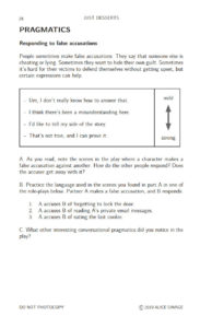
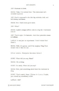
Starting in 2017, I started publishing drama-related learning resources by Alice Savage through my indie publishing company. At first, I formatted the plays to look like scripts from a play publishing house. After extensive research on what plays look like, I created the first row of designs. Simple, clean, and very play-like. I also created a harmonious pallet with room for expanding the series.
However, I realized that many teachers using our plays were not coming from the theater world necessarily. They were not familiar with play script design à la Samuel French, for example. So I redesigned the covers to be brighter and more intriguing, using a color photo in isolation in the center. Branding was done by including a band on the left side of the front cover in various colors.
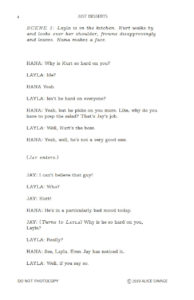
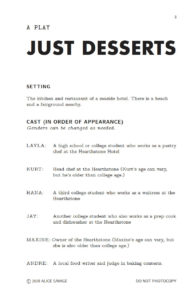
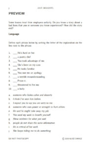
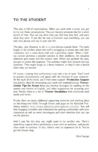
For the interiors, I kept the script formatting as it was clear to read. This required learning proper playscript formatting but also ensuring the design looked readable to a student whose first language is not English. I also wanted to keep the books short so the price would be low-teachers will likely purchase class sets. And I wanted them to be small enough to fit in the students’ hands. So I chose a highly readable font, even at smaller sizes and included as much white space as possible. The extra space also allows students to mark the script.
Publisher: Alphabet Publishing
Skills: Cover Design, Book Interior Design, Ebook Formatting, Publishing
COVER DESIGNS


