Formatting a print book is a complicated process, particularly if you are doing a textbook or activity book with lots of different kinds of text. A textbook will probably have a number of different kinds of text, each of which need separate formatting. These may include: headers, directions, readings, explanations, example sentences, tip boxes, numbered activity questions, and so on. While I really enjoy the process of creating a new book from scratch, it can be intimidating at first. So I’d like to break down my process for setting up a book with complicated formatting.
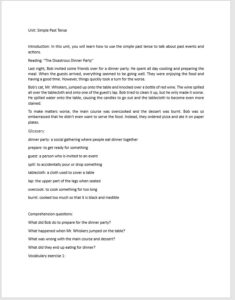
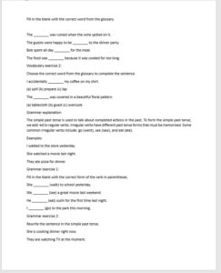
So let’s imagine we have the manuscript all finished (And I cannot emphasize enough how important it is to have your manuscript finalized before starting to format). Here’s a sample unit I had ChatGPT write up for me to save time.
Step 1: Go through the manuscript and make a list of all the different texts that will need their own separate formatting. Styles in InDesign or most formatting programs are hierarchical. That means you can create a basic style for regular text, then easily create a new style based on that basic style for, say, activity directions. Then if you decide to change your basic font, it will change the fonts for activity directions too.
So I like to start by dividing my list into at least 3 columns: text for regular body text, headings for any titles or headers, and then meta for things like page numbers, running headers (where the book or chapter title appears at the top of the page), the copyright page, and so on. I do lists as a sub category of text, because usually lists show up as activities or as sample sentences. I also like to name my styles by use instead of what the style looks like or its role. Others prefer names like h1, h2, h3, body text, ital text. Whatever works for you is fine. This is for your eyes only, so you can do it however you want.

Step 2: This may be the weirdest step, but I like to set up the styles first in my program before I enter the text. I follow the hierarchy I came up with in my list, so I start with a basic text style and then go through variations such as explanation, direction, example, and so on. Notice that I have set up the headings in a hierarchy, so it’s easy to change the fonts or spacings.
Keep in mind that you don’t have to be perfect here. You always have a chance to redo any styles or fine tune once you are working with the actual text. As you’ll see, some of my original ideas didn’t look very good in practice and I even made a mistake I needed to fix.
I also find that it’s hard to do some of the real fancy stylings such as colored boxes or borders without seeing the text on the page. So set up some basic ideas but don’t worry about being perfect. Feel free to play around. It’s really amazing what you can control with styles: fonts, font weight, spacing, indents, colors, backgrounds, underlining and borders, and more!
Step 3: I like to set up my manuscript with very light formatting. You don’t want to do too much because the book design software will mess it up. It also doesn’t really matter what the styles look like because you’re just using them as placeholders to design later. So, I find that using the built-in heading styles from heading 1 to heading 3 helps me keep track of the organization of my document. You can also do lists so that it’s clear where exercises begin and end. I normally do this as I write so this would technically be the real step 1.
NOTE: You can format a paperback book in Word. Word styles are not quite as powerful as InDesign styles, but they are pretty cool. So if you’re planning to publish directly from Word, set up your styles in the Style Menu and skip step 4 below!
Step 4: Place your manuscript into your InDesign document using the Place option. Do not use cut-and-paste the text in. That introduces all sorts of complications and can mess up any styles you might have used.
Step 5: Apply styles systematically. Go through your text, selecting each kind of text in paragraphs and apply the correct style. Don’t worry changing your styles yet. It’s better to play around once you have the whole text formatted. That way you can see how your styles look throughout the boo.
However, as I was applying my styles in the video below, I noticed that one of the texts looked terrible justified, and somehow numbering got turned on for directions. I did go ahead and fix those. Another cool trick is that you can delete a style you won’t be using again, and then replace it with another style. So I can turn all my Word Heading 2 styles into Section Headers all at once!
Step 6: Now that you’ve applied all your styles, you can play around. Change anything that you don’t like, finetune small things like the spacing or alignment, or even start over from scratch. In the video below, I switch fonts (which is easy because of the way I set up my styles), create a new style for the part headers, and finetune the reading.
I also created bigger margins. I should have set my document up more carefully. As you can see at around 2:12, the document looks pretty good.
Just to show off the power of styles, I decided to go a bit further and play around with some new borders and shading. Check out the final product at around 2:20 in the video below. Much more colorful and interesting. All of this took 45 minutes total of design time! And I still haven’t added images or icons or even any tables or individual textboxes.
Step 8: Create some draft variations to look at! It’s helpful when you have something you like to save a copy with a distinct filename and also export it to PDF. Then you can play around some more, find a layout that looks nice, save and export that, and keep going. Once you have 3-5 variations, walk away for a few days. Come back with fresh eyes and look at the PDFs. See what grabs you and what doesn’t. Maybe you like the colors in version1 and the header styles in version2 and the font in version3! This is a great way to create a design that you really love.
I hope this has been helpful in outlining the process of setting up a complex paperback book. Maybe you’ve also realized the power of styles, whether it be in InDesign or Word. This is by far my favorite part of the book design process because you can play and be creative!
Let me know what you think and whether you have any lingering questions, comments, or suggestions